During the run-up to the 2008 election I had the opportunity to work on a challenging mapping problem, as part of my work for We Also Walk Dogs. Our client MoveOn.org planned to run a multi-state get-out-the-vote field campaign. This kind of campaign involves teams of volunteers going door-to-door having conversations with voters and recording the results. Later the same volunteers will help turn out voters to their polling places.
The early phase of this project focused on picking the areas where the campaign would operate – a process known as turf assignment. The traditional way to do this is to assign work by precinct. We needed a way to display precinct maps visually to aid in picking precincts and assigning them to offices.
You might think that there would be some publicly available resource for precinct maps in a consistent format covering every state. Sadly, this is not the case. In fact, for reasons that escape me to this day precinct maps are carefully guarded secrets controlled at the state level. It is sometimes possible to buy the precinct map for a given state, but not always and certainly not in a single standardized format.
What we did have was the voter file. The voter file is a publicly available list of every voter in every state (almost, nothing is perfect of course). Critically for our purposes it includes both the voter’s address and their precinct. We theorized that we could essentially reverse engineer the precinct maps from the voter file data – essentially defining a precinct as a list of voters in that
precinct and then drawing a shape which enclosed them.
To give you an idea of how I thought it would work, consider this map:
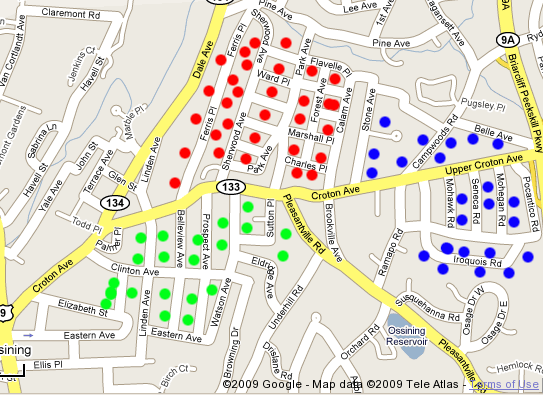
The dots on the map are voters assigned to three different precincts. My idea was to come up with some way to draw shapes around them which would approximate the actual precinct shape. For example:
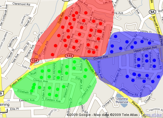
My first attempt at solving this problem was to write a geometric algorithm which attempt to find what’s call the “convex hull” containing all the voters in a precinct. The simplest way to think about a convex hull is as the shape a rubber-band would make if you pulled it around all the points. In this case it might look something like:
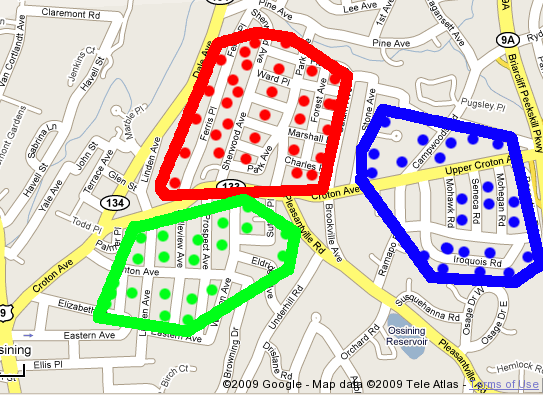
Not bad, right? Sadly things in the real world aren’t so simple! It’s unfortunately all too common to have precincts more like this:

And when you try to draw a convex hull around these points you get:
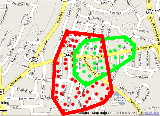
And if you think that’s bad, imagine what that would look like if there were a few more precincts shown and they all had overlapping segments. It’s not unheard of for one precinct to entirely enclose another!
Even worse, the voter file data contains errors – some people are assigned precincts that are actually many miles away from where they should be. When you try to fit a convex hull around a precinct with just one bad address you get a shape with a very long spike. Ugly and ultimately unusable.
My first solution to this problem was to divide the map into a grid and color each grid box according to its composition, subdividing as necessary. The maps produced this way were actually surprisingly usable, given the brute-force nature of the algorithm. They looked something like:
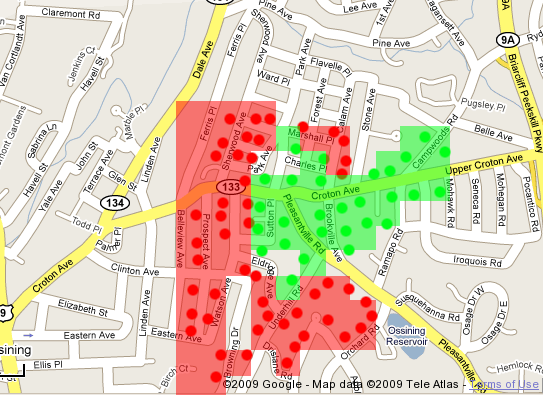
This worked but it was still pretty far from ideal. In particular it looked nothing like the pretty paper precinct maps that people are used to looking at.
The final solution I arrived at after boning up on my math skills was something called a Voronoi diagram. In simple terms a Voronoi diagram forms shapes by including all the area which is closer to a given point than any other. It’s ideal for building up maps based on a set of points.
Here’s what the final results looked like:
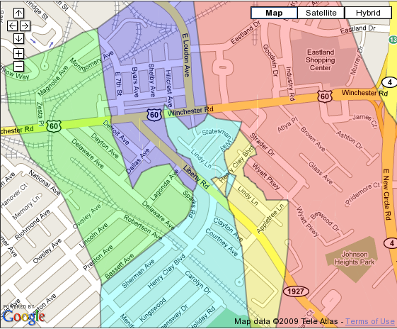
As you can see the Voronoi algorithm is able to construct shapes to fit very complex constraints, and it even provided enough shape data to draw outlines around the shapes. Compared side-by-side with the real precinct maps (often just scans of paper maps, sadly) the generated maps were often very close.
If you’re interested in using the Voronoi algorithm in your own code I was able to release the code of it as a Perl module on CPAN. You can download it here:
http://search.cpan.org/~samtregar/Math-Geometry-Voronoi/
I’m hoping the 2010 elections will give me a good excuse to dive back into this problem – there’s still so much that could be done to make precinct maps easier to use.
8 Comments
Very nice work mr. Sam Tregar. I love seeing useful code released on cpan.
Sam – Cool thinking. We have all the voter files, maybe you could work on something for us as we want to make the data more sliceabale and diceable.
Cool post, really fun to read about and thanks so much for making it OSS.
Just so you know, the license declaration you have in the README you have listed on CPAN[1] makes it exclusively available under the Artistic License 1.0[2], meaning it’s incompatible with the Perl 6 license (Artistic License 2.0[2]) and the GNU GPL.
If you wanted to change this you could switch out “any later version of Perl 5 you may have available” with “any later version of Perl you may have available” or something similar.
Cheers.
1. http://search.cpan.org/src/SAMTREGAR/Math-Geometry-Voronoi-1.3/README
2. http://en.wikipedia.org/wiki/Artistic_License
@License Man
Interesting point – I had no idea there was a new license for Perl 6. I guess I’ll deal with this if/when I port the code to Perl 6. I imagine it will need lots of changes considering it’s XS code.
Opulently I acquiesce in but I dream the post should have more info then it has.
Very Interesting!
Thank You!